RECODE
A SKINCARE BRAND THAT FINALLY LOOKS AS GOOD AS IT WORKS.
SELF-INITIATED BRAND REFRESH
LOGO PACKAGING BRAND SYSTEM

CHALLENGE
Recode's identity was quieter than the product itself: clean, minimal and easy to forget in a category full of brands that look the same.
IDEA
Make a checkerboard-inspired symbol the repeatable core of the identity, so it works in the logo, across packaging and in small cropped details.
RESULT
A brighter, sharper, more ownable identity where logo, colour, pattern and packaging work as one system.
A PRODUCT I ALREADY USED.
AN IDENTITY I COULDN’T STOP WANTING TO FIX.
I came across Recode as a customer first, not as a designer. I liked the product, but every time I saw the brand, the identity felt quieter than the product itself. The packaging worked, the products were there, but visually it never felt distinctive enough to stay in my head. That disconnect became the reason to rework it.
The first instinct was to clean everything up simplify the logo, refine the typography, make the packaging feel more polished. But that still felt too safe. Skincare already has plenty of brands that are clean, minimal and easy to forget. Recode needed something that could hold attention, feel modern, and still have enough personality to become recognisable on its own.
The visual system started with the logo and the graphic symbol. I wanted something that could do more than sit next to the brand name, so the checkerboard-inspired element became a repeatable part of the identity. It could live inside the logo, stretch across packaging, appear as a pattern, or show up in small cropped details and still feel connected to the same brand.
Colour did a lot of the heavy lifting. The deep green gives the identity weight, while the orange, pink and brighter accents bring in the energy. The combination feels current, but more importantly, it gives Recode a visual presence that can stand out even against darker backgrounds or crowded digital spaces. The aim was to create a brand that could almost spark in the dark.
Typography stayed clean and confident so it could balance the louder parts of the system instead of competing with them. The packaging then became the point where everything came together logo, colour, pattern, hierarchy and product information working as one system instead of separate decorative choices.
The final identity feels brighter, sharper and more ownable without losing the accessibility of the original brand. The product was already doing its job. The redesign was really about making sure the brand finally looked like it knew that too.


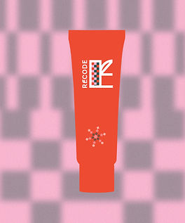


The result was a stronger, more recognisable visual identity for Recode with a refreshed logo, symbol, typography, colour system and packaging language that work together as one brand. The brighter contrast and graphic pattern give the products more shelf and digital presence, while creating a flexible system that can extend across future products and communications.


