WILDOOR
AN INVITATION INTO THE FOREST,
NOT A WARNING ABOUT IT.
SELF-INITIATED BRAND IDENTITY
LOGO PACKAGING
ILLUSTRATION

There's a specific feeling right before you leave the trailhead bag on your back, signal about to disappear, the comfortable version of your life on pause for a few days. That threshold moment is the whole idea behind the name. Not the campsite, not the gear the door you walk through to get there. Wild Door isn't a place. It's the decision to open one.
The problem was that almost every camping brand treats that threshold as something to brace for. Deep forest green, charcoal, maybe a rust orange if they're feeling adventurous moody, serious, like the forest is a thing you survive rather than a door you're excited to walk through.
I went looking for the obvious symbols first a flame wrapped around a door, a lantern with a door cut into it. Literal camping, basically. Neither one earned its spot on the page. They read like clip art doing its best impression of "outdoorsy," not like a door anyone would actually want to open.
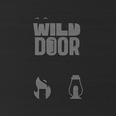

THIS WAS NEVER GOING TO BE A BRAND ABOUT SURVIVING THE FOREST. IT'S ABOUT WANTING TO GO BACK IN.
The real idea arrived sideways, from a completely unrelated object: a hotel door hanger, the kind that says Do Not Disturb. The hole punched through the top of it the part that hooks over a doorknob looked like it wanted to be something else if I let it. Curved just right, it became an elephant's trunk and ear without changing what the shape actually does. It still works as a door hanger. It just also happens to be an animal, which felt exactly right for a brand about discovering the wild nature quietly hiding inside something perfectly ordinary.
Getting there wasn't quick. I went back and forth on how literal the elephant should read, how much of the door hanger's actual shape to protect, whether the mark needed the tagline to explain itself or whether the shape alone could carry the whole idea. Simplifying it took longer than coming up with it in the first place usually a sign the idea underneath is actually worth keeping.
The tagline is what finally settled it. A door hanger's entire job is normally to keep people out stay away, come back later. Wild Door flips that completely: Open Access. Not a warning hanging off a doorknob, but an invitation. That one reversal ended up being more the point of the brand than any single visual choice.
Color was the last real decision, and the one I nearly got wrong. Every instinct for a forest brand pulls toward dark deep pine, black, rust for warmth. I tried that first, and it made the whole mark read like a hazard sign, like something warning you to stay on the path. But Wild Door was never about the forest's dark side. It's the good kind of getting lost curious, not careful. So the green went bright instead of deep, loud instead of moody, until it finally looked like an invitation instead of a caution.
The mark needed a bigger world around it too, not just a label standing alone. A circular badge surrounds it with the rest of the cast a bird overhead, a turtle and a crocodile tucked into the corners, trees standing in for an actual place instead of decoration. On the real product, a canvas drawstring bag, that whole little world travels in cream against the same bright green, so the badge and the door-hanger mark read as one story instead of two assets bolted together.
A sign that usually means stay away, doing the exact opposite, in a green with nothing to hide. Somewhere between the doorknob and the elephant, that stopped being a logo and started being the whole idea of the brand.


